RíOrganized: James Charles Pantry Reveal
This RíOrganized story kicks off the same way most of them seem to… I woke up to a text. This time, it was from the one and only, James Charles. Say whaaaat? Surely I was still asleep? For sure not. James had texted asking if I could help get him settled into his new home (another Jen Atkin referral for the win!). Immediately my answer was a resounding YES.
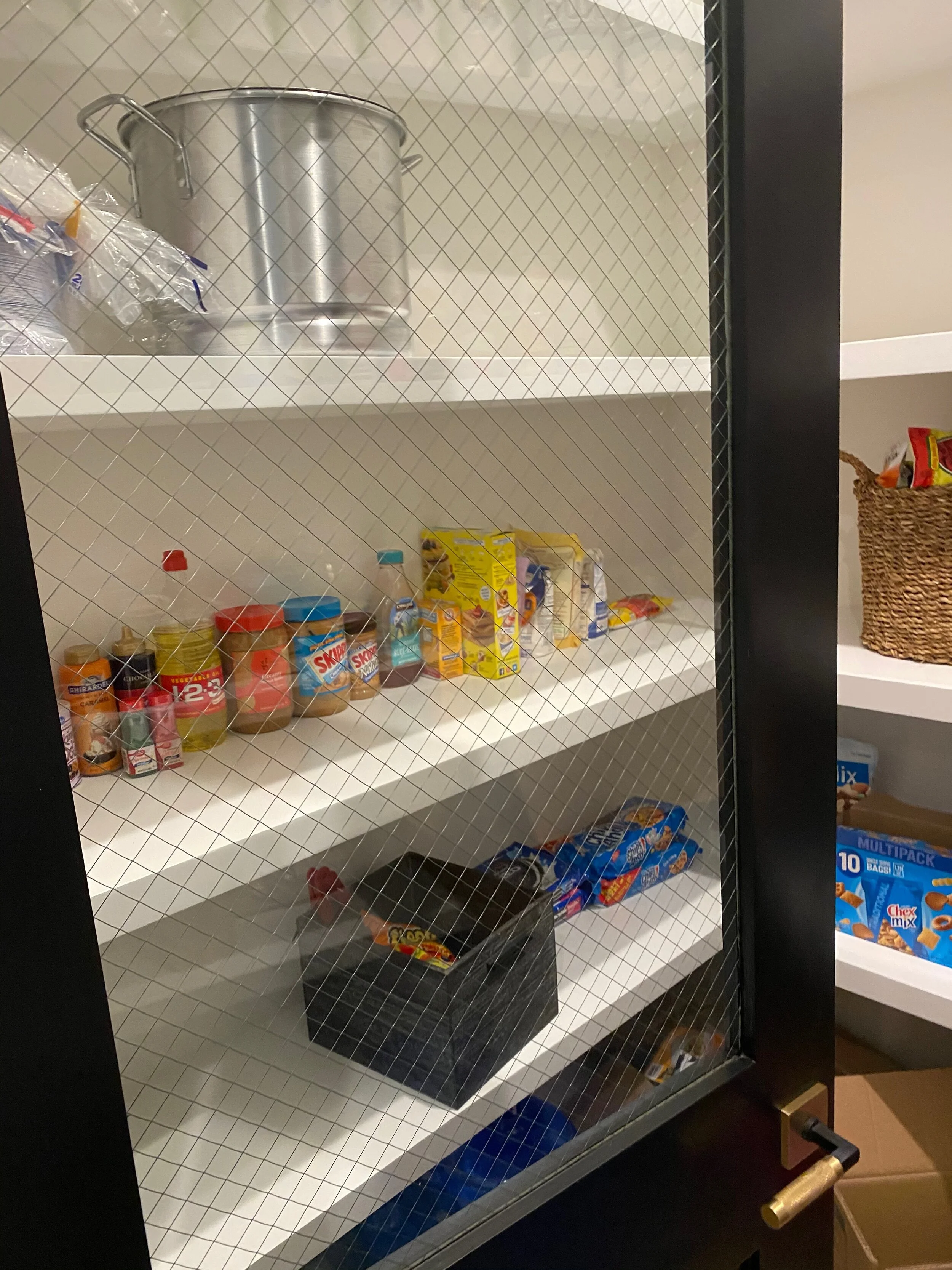
Before
Before
Like he said when he texted me, he was looking for us to help with multiple spaces since he had just moved in. We tackled a handful of areas but we were both most excited about the pantry and his insane makeup wall! Let’s give the pantry it’s own moment on this post and we can save the makeup for a part II. Sound cool? K, check this pantry out!
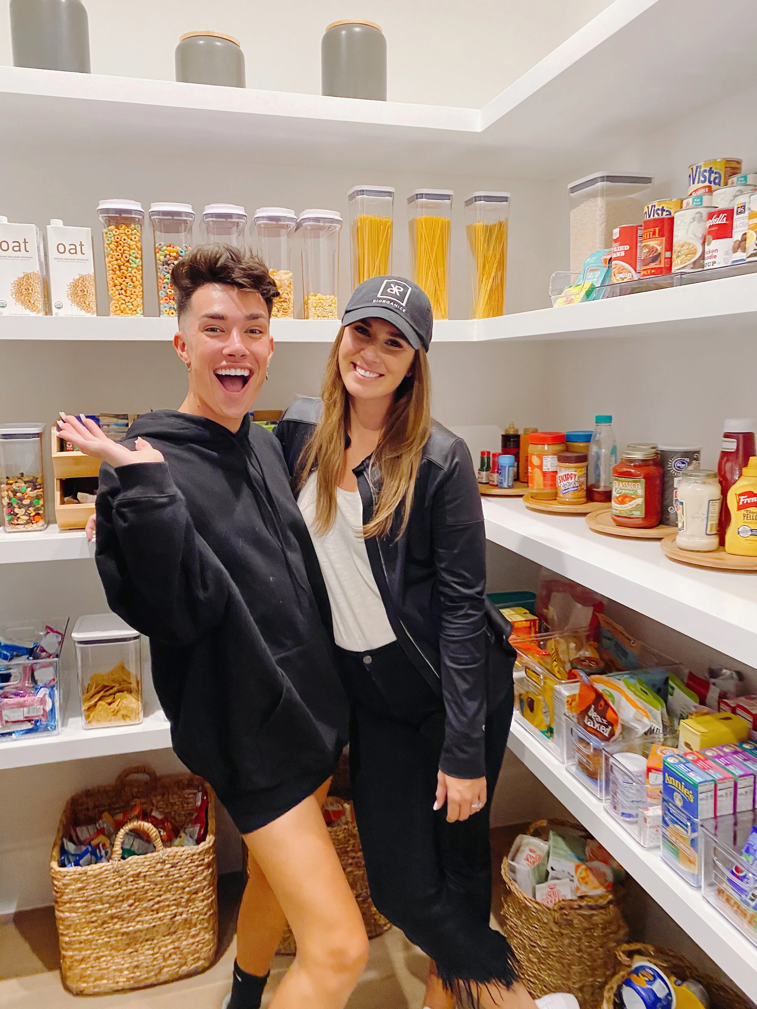
The goal for James’ pantry was to marry function with beauty and deliver a space that would be easy to navigate and maintain.
First things first, we had to empty and categorize it all. A blank canvas is the best way to approach any project - especially if you’re working with a deep-shelf pantry. It will allow you to imagine how the space should be, instead of how it already is.
Next up, the purge. It’s really helpful (and necessary) for a client to be present during this time. James did a great job letting us know what foods were a must to keep and which ones (usually his roommate’s, hah!) could go.
Once the purge is complete and we know what is staying, the space planning begins. This is the part where I get to design a system that is custom to James and his roommates. For example, they use tomato sauce a lot to make soup, they enjoy baking, snacks and juices come and go super fast - these are all things I take into consideration when space planning each client’s home. For those of you at home, think about what you reach for all the time. Whatever those items are, they need to be front and center!
Pro Tip
Use clear containers for easy viewing. This way you know what’s what and how much of each item is left.
When we have a plan in mind, placement moves quickly as we already know where items will be living. The plan really starts to come together during this step and will give us a clear idea of what product will be necessary to elevate the space and keep it sustainable.
This is also the time to grab any necessary measurements like shelf depths, heights and widths. There are few things more aggravating than purchasing bins that just don’t quite fit!
Lucky for us, our brand partner, iDesign, provided so many wonderful products to help take this pantry space to the next level. Their clear bins are so universal and definitely a fan favorite over here.
The final phase of any project is my absolute favorite - install! This is where the goals become reality. We showed up with all of the goods to deliver a pantry James would be in love with! He now knows where everything is, his favorites (and his roommates) are front and center and more importantly, it’s sustainable for him and his lifestyle!
We loved doing this pantry for James, but the real showstopper is that freaking makeup wall. Be sure to check out our FIRST EVER YouTube video that shows behind the scenes of this project and the adorable reveal!


